Configuration
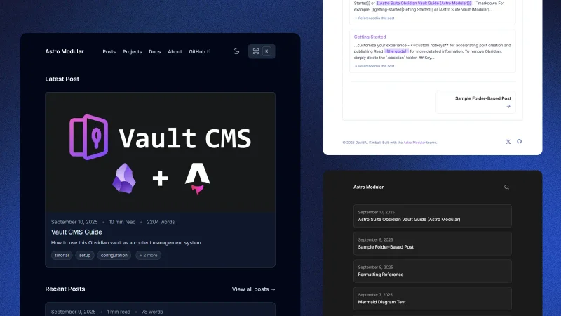
This comprehensive guide covers everything needed to set up and customize your modular Astro blog, designed for Obsidian users who want to publish content with minimal friction.
Prerequisites & Setup
You’ll need:
- Git
- Basic markdown familiarity
- Obsidian (optional)
If you want to build and test locally, you’ll need:
- Node.js 24.13.0+
- pnpm 10.29.3+ (recommended) or npm
Installation
# Install pnpm (if not already installed)
npm install -g pnpm

# Install dependencies
pnpm install

# Preview
pnpm dev # or pnpm preview
# Available at http://localhost:5000

# Build for production
pnpm build
Configuration
If this applies to you, you can jump right to the Content Structure section.
Core Settings
Configure everything in src/config.ts. The configuration is organized in sections:
export const siteConfig = {
  // Site Information
  site: 'https://yourdomain.com',
  title: 'Your Blog Title',
  description: 'Your blog description',
  author: 'Your Name',  // Global author for all posts
  language: 'en',
  faviconThemeAdaptive: true,
  defaultOgImageAlt: "Astro Modular logo.",
}
Customization
Theme & Layout
Select theme and layout options in the config:
// Global Settings
theme: "oxygen",
customThemeFile: "custom",
availableThemes: "default", // Shows all built-in themes
fonts: {
  source: "local",
  families: {
    body: "Inter",
    heading: "Inter",
    mono: "JetBrains Mono",
  },
  display: "swap",
},
layout: {
  contentWidth: "45rem",
},
tableOfContents: {
  enabled: true,        // Global TOC toggle for all posts
  depth: 4,            // Maximum heading depth (2-6, where 2=H2, 3=H3, etc.)
},
footer: {
  enabled: true,
  content: `© 2025 {author}. Built with Astro Modular.`,
  showSocialIconsInFooter: true,
},
hideScrollBar: false,  // Hide browser scrollbar
scrollToTop: true,     // Show scroll-to-top button
featureButton: "mode", // "mode" | "graph" | "theme" | "none" - what the main feature button does
deployment: {
  platform: "netlify", // "netlify" | "vercel" | "github-pages" | "cloudflare-workers"
},
The theme options are currently Oxygen, Minimal, Atom, Ayu, Catppuccin, Charcoal, Dracula, Everforest, Flexoki, Gruvbox, macOS, Nord, Obsidian, Rosé Pine, Sky, Solarized, Things, and Custom. Theme changes are visible in real-time with pnpm dev.
Custom Themes
You can create your own custom themes by:
- Rename the template: Rename
src/themes/custom/custom.tsto whatever you want - Modify colors: Update the color scales to match your design
- Update config:
- Set
theme: "custom"insrc/config.ts - Set
customThemeFile: "your-theme-name"(filename without .ts extension)
- Set
- Test: Use
pnpm devto see your theme changes in real-time
The system automatically finds and uses your custom theme!
See src/themes/custom/README.md for detailed instructions and best practices.
Font Configuration
Customize fonts for headings, body text, and code with flexible loading options:
fonts: {
  source: "local", // "local" for self-hosted fonts, "cdn" for Google Fonts CDN
  families: {
    body: "Inter",      // Body text font family
    heading: "Inter",   // Heading font family
    mono: "JetBrains Mono", // Monospace font family
  },
  display: "swap", // Font loading strategy: "swap", "fallback", or "optional"
}
Font Loading Options:
- Local fonts (
source: "local"): Self-hosted fonts for better performance and privacy - CDN fonts (
source: "cdn"): Google Fonts CDN for unlimited font choices
Supported Fonts (Local Mode):
- Sans-Serif: Inter, Roboto, Open Sans, Lato, Poppins, Source Sans Pro, Nunito, Montserrat
- Serif: Playfair Display, Merriweather, Lora, Crimson Text, PT Serif, Libre Baskerville
- Monospace: Fira Code, JetBrains Mono, Source Code Pro, IBM Plex Mono, Cascadia Code
Command Palette
The command palette provides instant navigation and search functionality:
commandPalette: {
    enabled: true,
    shortcut: "ctrl+K",
    placeholder: "Search posts",
    search: {
      posts: true,
      pages: false,
      projects: false,
      docs: false,
    },
    sections: {
      quickActions: true,
      pages: true,
      social: true,
    },
    quickActions: {
      enabled: true,        // Enable quick actions section
      toggleMode: true,     // Show dark/light mode toggle
      graphView: true,      // Show graph view button
      changeTheme: true,    // Show theme switcher
    },
}
Features:
- Instant Search: Press
ctrl+K(or a different shortcut you define) to search content - Quick Actions: Theme switching, navigation shortcuts
- Customizable: Change shortcut, placeholder text, and enabled sections
Profile Picture
Add a personal touch with a configurable profile picture:
profilePicture: {
  enabled: true,
  image: "/profile.jpg",        // Path to your image (place in public/ directory)
  alt: "Profile picture",       // Alt text for accessibility
  size: "md",                   // "sm", "md", or "lg"
  url: "/about",                // Optional URL to link to when clicked
  placement: "footer",          // "footer" or "header"
  style: "circle",              // "circle", "square", or "none"
}
Navigation Configuration
Customize your site’s navigation menu and social links:
navigation: {
  showNavigation: true,           // Show/hide main navigation
  style: "traditional",           // "minimal" or "traditional" navigation style
  showMobileMenu: true,           // Show mobile menu toggle
  pages: [                        // Navigation menu items (NavigationItem[])
    { title: "Posts", url: "/posts/" },
    { title: "Projects", url: "/projects/" },
    { title: "Docs", url: "/docs/" },
    { title: "About", url: "/about/", children: [...] },
  ],
  social: [                       // Social media links
    { title: "GitHub", url: "https://github.com/username", icon: "github" },
    { title: "X", url: "https://x.com/username", icon: "x-twitter" },
  ],
}
Homepage Configuration
The homepage content is controlled by the homeOptions section:
- Featured Post: Show latest post or a specific featured post
- Recent Posts: Display recent posts with configurable count
- Projects & Docs: Show featured projects and documentation
- Home Blurb: Control placement or disable completely
Post Options
Configure post-related features in the postOptions section:
postOptions: {
  postsPerPage: 6,
  readingTime: true,
  wordCount: true,
  tags: true,
  linkedMentions: {
    enabled: true,
    linkedMentionsCompact: false,
  },
  graphView: {
    enabled: true,
    showInSidebar: true,
    maxNodes: 100,
    showOrphanedPosts: true,
  },
  postNavigation: true,
  showPostCardCoverImages: "featured-and-posts",
  postCardAspectRatio: "og",
  customPostCardAspectRatio: "2.5/1",
  comments: {
    enabled: false,
    provider: "giscus",
    // ... other comment settings
  },
}
Table of Contents:
Enabling table of contents in the root tableOfContents section is a global toggle for all posts. Other content types (pages, projects, etc.) show TOC by default and can be hidden via frontmatter.
Linked Mentions:
enabled: true- enable linked mentions section at the end of the pagelinkedMentionsCompact: false- choose between detailed view (default) or compact view
Cover Image Options:
Affects how cover images are displayed on post cards: "all", "featured", "home", "posts", "featured-and-posts", or "none".
Comments System
The theme includes a Giscus-powered commenting system that uses GitHub Discussions. See the full guide for setup instructions.
Content Structure
src/content/
├── posts/                   # Blog posts
├── pages/                   # Static pages
├── special/                 # Special pages (home, 404, etc.)
├── projects/                # Featured projects
├── docs/                    # Documentation
└── .obsidian/               # Obsidian vault setup
Writing Content
Posts
Create posts in src/content/posts/. H1 titles are hardcoded from frontmatter, so content should start with H2.
---
title: "Post Title"
date: 2026-02-22
description: "A brief description"
tags: ["tag1", "tag2"]
image: "cover.jpg"
imageAlt: "Cover image description"
draft: false
---

## Start with H2
Post content here.
Pages, Projects, & Docs
All content types support folder-based organization with co-located assets. Use draft: true to keep content hidden from production.
Obsidian Integration
Using the Included Vault
Open src/content/ in Obsidian to use the preconfigured vault features:
- Astro Composer: Easily create and manage posts
- Minimal Theme: Optimized for writing
- Git Plugin: Commit and sync directly from Obsidian
Read the guide for more detailed information.
Key Features
Command Palette
Press ctrl+K for instant search, quick actions, and theme switching.
Internal Linking
[[Post Title|Custom Text]]- wikilinks (posts only)[Post Title](posts/post-slug.md)- standard markdown links- Linked mentions show post connections automatically.
Image Optimization
- WebP conversion for performance
- Responsive grids for multiple images
- Asset synchronization copies assets to public directory automatically.
Deployment
Build your static site with pnpm build. It generates a production-ready bundle optimized for your chosen platform.
Troubleshooting
Check image paths, frontmatter syntax, and ensure target posts exist for wikilinks.
Your modular Astro blog is ready for your content!